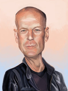
I think I have this to a good stopping place. There are a few areas which I think could be refined a bit further but I am pleased with what I have. I had real trouble exagerrating BW here without losing a likeness, so this is quite portrait-y. I want to push the hell out of my next drawings to try and go crazy with exagerration. This face didn't lend itself to caricature easily. I went for the second painting technique, skipping the value painting and going right for color.
My pallette was red orange as the dominant, with blue and green splits. I tried to capture the softer side of Bruce; we all have our masculine and feminine natures, and he is such a macho macho man that I thought setting him across pastel pink and blue would be fun.


3 comments:
Awesome piece Kelly! Very Pastel like colours too - cool touch. I like that you've combined the 2 references - quite seamlessly too!
Super
Very nice palette. I agree with Tim...looks like pastels, and yes, that's a good thing. :)
Great job on life in the eyes.
Nice Kelly! Jason did give us a challenge with Bruce. He is not the easiest or most obvious to caricature...I think it's fine to be a little portraity - you still have enough exaggeration to be calling this a caricature. If you wanted you could push the space between the nose and mouth further... That's the one place I found I could push pretty far and still keep the likeness. Cheers!
Post a Comment