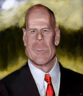
Pretty much finished. I'm still tweaking but figured I'd add to the mix. Anyone see any glaring issues? I tried keeping the values darker as suggested and blocked in more. The color was tough because he has a pretty splotchy face. Also since his face is lit from a flash it seemed to me that the cooler colors were more centered and the warmer tones further to the outside instead of the other way around. Am I off there?
Still learning tons from all the critiques and lessons. You guys do amazing stuff.


4 comments:
Super work - Nice job on the eyes!
Yeah I noticed that too Leef. Nice job on teh face. The bright yeloow/green is a tad distracting - might be nice to knock down the saturation a bit with some grays...great face though!
Hey, great job. I agree with mark on that b/g, there are a couple recent posts with really wild ones, would look better with just a little work on that part. (Another good reason to post, now I'm paying more attention to mine)
I think Jason is going to produce a legion of the best ear- draughtsmen in the world.
Jon
Yeah, hilarious. I can't stop looking at peoples ears now. I've changed the background now but it's still a bit hot. I'll probably spend more time on it next go. Just turned it in.
Post a Comment