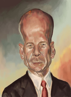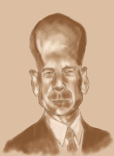

If I had to describe my technique in 1 word, it would be S-LOW! I'm going to struggle to finish this for tomorrow!
I think I may have to keep it quite painterly - that's right, you can't mark a man down for being painterly!
I'm using artistic terms to disguise my faults, and hoping not to resort to 'Cubism' or 'Modern'.
Digital painting is fairly new to me - however I've only just realised for the last few paintings I've kept my brush opacity at 90% - no wonder it was hard to blend colours! - Be encouraged!
As a point of interest, I've also posted below a caricature of Bruce Willis I did before the course - totally different!
I think photo reference & pose make a large difference!


3 comments:
I agree, the photo reference makes him look different to what he usually does...or maybe it's because he's aged? Whatever, the top of the head looks far more exaggerated now, especially compared to your earlier work. Steady progress man, looking solid, good luck!
I like what you have so far. I think the face looks great! but the top of the head looks like an egg about to hatch. I think if you bring it down a bit you would have a really funny caricature. Bruce is not an easy guy to draw.
I think the problem is his bald head. It's so obvious that it feels like you should make it bigger, but by keeping it relatively small it makes the space between the nose and mouth seem bigger, and I think that's where the weight is. Your colours are looking great!
Post a Comment