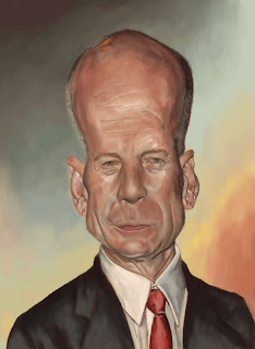
Well here's my final! With more time I may have changed quite a few things, but had to work up what I've got!!!
I appreciate the tips on my previous post - definitely some food for thought!
I'm really excited by what I've seen - everyone seems to have really got into gear and shown something of their own style in their work - very cool to see.


4 comments:
excellent details and rendering. The forehead lines are throwing me, they lok a bit severe compared to the delicacy of the rest of the face. I think we used similar palletes, I like what you did with the vibrant background colors.
COOL...I'm getting a "Lucien Freud" feeling form this painting. Nice style.
Not crazy about the likeness, and the unfinished quality of the jacket in comparison with the face is a bit jarring...but the rendering and colors are beautiful. Really well done.
Thanks guys! Yeah I think I lost the likeness along the way on this one, and somewhat overdid the forehead! I learn't a lot by doing it though - and that's what counts right!
Post a Comment